Suggested Visual Changes to the Game (See the Photoshop Examples!)

October 17, 2018 7:44AM
edited March 2019
Update: A few new pics added. Feel free to comment with something you'd like to see Photoshopped and (if possible) I can give it a stab with enough direction given. 
User submissions are posted at the bottom of this original post and in this forum thread as a reply.
.
.
.
ORIGINAL POST:
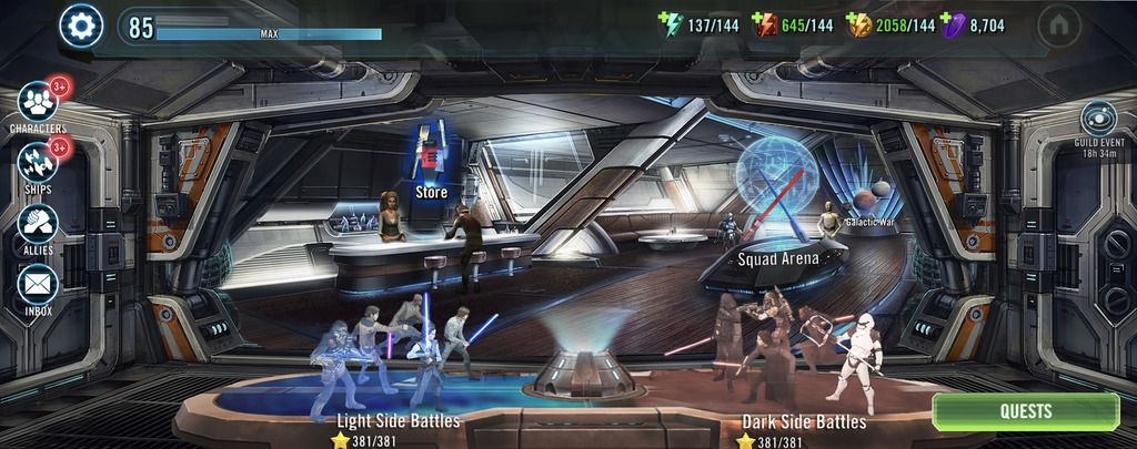
I've been playing SWGOH since the very beginning and as time has went on, many aspects of it have been dramatically improved and overhauled; new game modes, QoL updates, Raids, ships and so on. Yet there are some visual aspects of the game that have gotten stale to look at. For example, I've always wanted to see the Cantina re-imagined or re-designed, or the pre-battle character selection menu updated and many other things that I feel could revitalize the look and feel of the things we spend the most time looking at; the Cantina itself.
Below are just some examples. I'm no Photoshop wizard, but I felt it served the cause better to have something to look at rather than just trying to "see what I see" through text.
.
0. Of course I know the following will likely never happen and I'm not saying use this exact image, just demonstrating a different setting for the Cantina.
I've longed for a venue switch in where we can still use the holotables but instead of at Cantina we are on, for example, a ship's command bay and the holotables (instead of just games at a Cantina) are the training for battles and events. Same setup as the game now, just changing the context. Or maybe we're at Canto Bight, etc etc
.
.
.
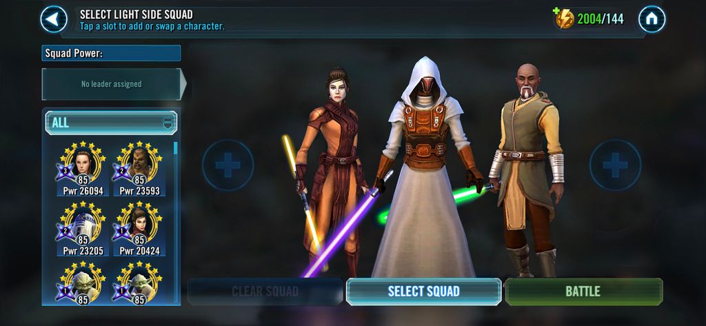
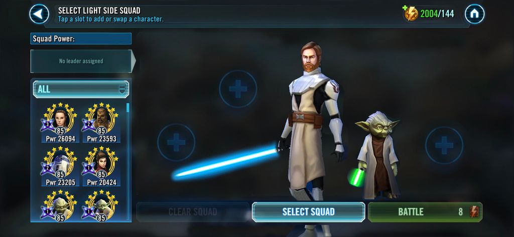
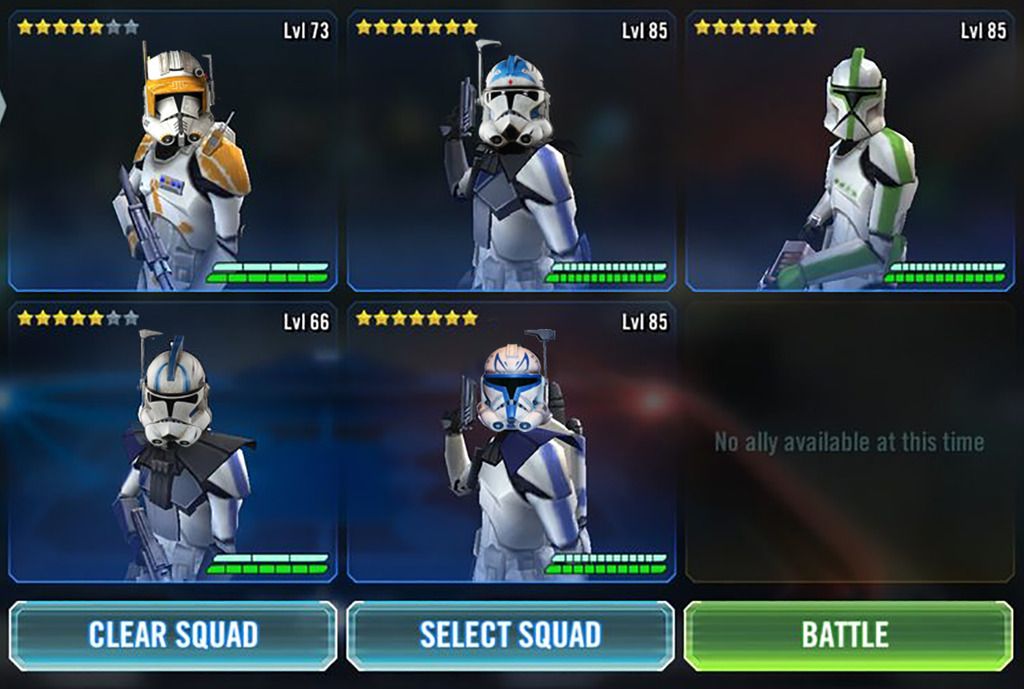
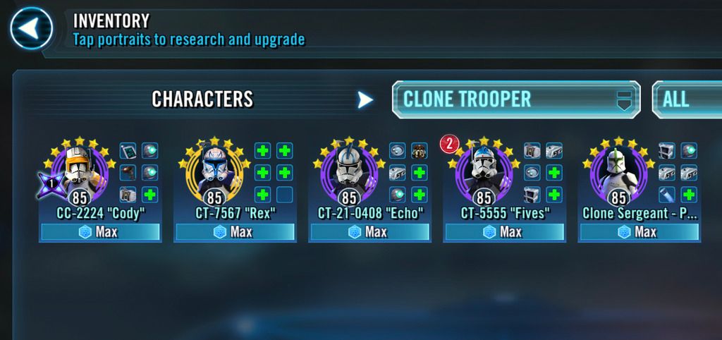
1. So the first thing is the character selection screen. We have these beautiful character models yet you barely get to enjoy them. During battle its their backs we see, during character selection its only their upper-half and when browsing the roster it's only their heads. I've seen other games do it and it's really nice to get to see them in their full pose outside of just when adding gear.
Also perhaps they could do some basic animation when standing there?
.
.
.
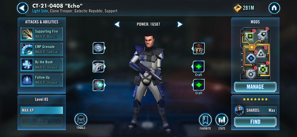
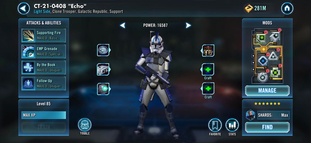
2. The second thing has been long asked for, but with the Separtists getting a rework in some form soon and all of Clone Wars coming back into the fray, what better time than to make some minor adjustments to the look of our favorite clones? We've seen Gar Saxon have it both ways where he both holds and wears the helmet, so it's clearly doable.
The clones arguably have more personality and identity in their unique helmets then they do in their IDENTICAL faces.
.
.
.
2 1/2 Well aware of the pipe-dream status of this one, but I figured I'd share what I thought would be an Toggle/Equip option to the game for select characters. Whether it be Hood Up or Down, Helmet on or off, maybe there could exist a way one day to minimally customize the appearance of our roster.
.
Notice the "Toggle" button in the bottom left corner...
.
.
.
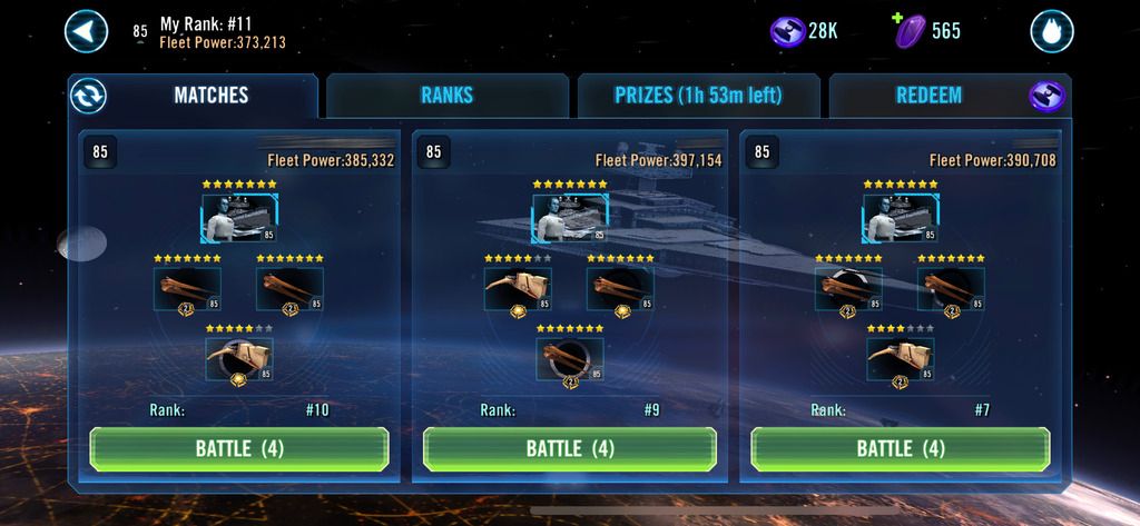
3. This is a two-in-one.
The recent addition of revealing which opponent has zeta'd a certain character was a welcome change. On the ships side however, omega's are arguably equally important yet there isn't a clean and simple way to view who has applied them. This change would display which ships have been omega'd and how many applied.
Secondly, a lot of the menus we browse feel like a house with no art on the walls. They're flat color-walls and don't feel epic or have any distance to them. It would be nice to feel like we're about to enter a battle by seeing space in the background as if we were about to deploy.
.
.
.
4. I'm not saying the ships Cantina section should be exactly like this, it's just for reference. But I want to again reinforce the idea of more open environments and generate the feel that you're about to enter battle when going to the ships area. It's only logical that the player would be in a Hangar before a ship battle anyway and gives a fresh look to a stale (or less emphasized) area of play. I understand we're at a holotable but perhaps there is a visual compromise to be had somewhere.

.
.
.
5. This one may seem more like a QoL request but I feel like the "sim" option could offer a tiny bit more control such as the option to choose how each individual toon will use their abilities. For example, instead of choosing between them all using "Basic Only" or them all using "All Abilities", you could specify what abilities an individual Hero could use while simming. This would especially be useful for those of us who sim in raids and we'd want a particular hero to only use their basic while allowing another to go crazy and use all available abilities. Maybe the same force touch that brings up buff info could also reveal a mini-context menu for sim options as seen below.

.
.
.
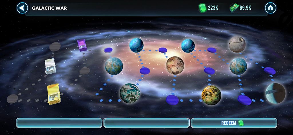
6.
I know Galactic War has been collecting dust but when you consider the name of it, these battles don't come across as very "Galactic". Perhaps simply changing the treasure icons to planets could offer a refreshing look to a now boring menu while also visually representing the Galactic scale of the battles. Then once you've successfully attacked, it reveals the treasure box as it does now to illustrate it's defeat and your victory.
Also, just like we have Hard nodes and Normal nodes, maybe we could see the old GW difficulty (very hard) come back under a selectable option without Sim for those players seeking greater rewards. But if you aren't interested in that then you can just select Normal and sim it the way you do now. I mean it's called GALACTIC WAR, what an epic name and we pay it no attention at all!

OR
The actual talented designers could do wonders but these are just rough-drafts to give an impression.
.
Anyways, there's a bunch more I want to mess with, but for now I'm curious what others think. Is there any interest in seeing the game get a visual update?
I know there are plenty priorities with bugs and Revan's event, but I personally feel like the look has gotten stale in some areas and it would be nice to see something different when logging in daily for YEARS now.
We've been getting new furniture for our SWGOH home which is great, but a paint job can go a long way too.
Thoughts?
.
.
.
.
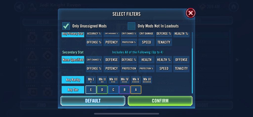
User Suggestion 1 by @Starquencher in this post
Star1.
Tier colors and dots added to mod filters screen
.
.
.
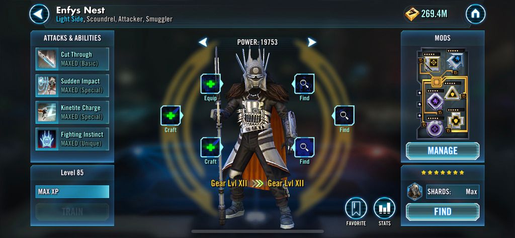
Star2.
The background gear wreath was too dominating to be in focus with the hero so it was blurred with the background to allow focus on the important items but still allowing the player to appreciate the earned prestige.
.
.
.
Star3.
Scrolling simply cannot be eliminated as some bodies of text will always be expanding. That said, the amount of scrolling can be reduced by only showing the upgrade requirements when the player clicks "Upgrade", then the text window shrinks to see what is needed. Once the player completes the transaction, the text window expands again and the "completed" check mark is displayed in a smaller fashion.
User submissions are posted at the bottom of this original post and in this forum thread as a reply.
.
.
.
ORIGINAL POST:
I've been playing SWGOH since the very beginning and as time has went on, many aspects of it have been dramatically improved and overhauled; new game modes, QoL updates, Raids, ships and so on. Yet there are some visual aspects of the game that have gotten stale to look at. For example, I've always wanted to see the Cantina re-imagined or re-designed, or the pre-battle character selection menu updated and many other things that I feel could revitalize the look and feel of the things we spend the most time looking at; the Cantina itself.
Below are just some examples. I'm no Photoshop wizard, but I felt it served the cause better to have something to look at rather than just trying to "see what I see" through text.
.
0. Of course I know the following will likely never happen and I'm not saying use this exact image, just demonstrating a different setting for the Cantina.
I've longed for a venue switch in where we can still use the holotables but instead of at Cantina we are on, for example, a ship's command bay and the holotables (instead of just games at a Cantina) are the training for battles and events. Same setup as the game now, just changing the context. Or maybe we're at Canto Bight, etc etc
.
.
.
1. So the first thing is the character selection screen. We have these beautiful character models yet you barely get to enjoy them. During battle its their backs we see, during character selection its only their upper-half and when browsing the roster it's only their heads. I've seen other games do it and it's really nice to get to see them in their full pose outside of just when adding gear.
Also perhaps they could do some basic animation when standing there?
.
.
.
2. The second thing has been long asked for, but with the Separtists getting a rework in some form soon and all of Clone Wars coming back into the fray, what better time than to make some minor adjustments to the look of our favorite clones? We've seen Gar Saxon have it both ways where he both holds and wears the helmet, so it's clearly doable.
The clones arguably have more personality and identity in their unique helmets then they do in their IDENTICAL faces.
.
.
.
2 1/2 Well aware of the pipe-dream status of this one, but I figured I'd share what I thought would be an Toggle/Equip option to the game for select characters. Whether it be Hood Up or Down, Helmet on or off, maybe there could exist a way one day to minimally customize the appearance of our roster.
.
Notice the "Toggle" button in the bottom left corner...
.
.
.
3. This is a two-in-one.
The recent addition of revealing which opponent has zeta'd a certain character was a welcome change. On the ships side however, omega's are arguably equally important yet there isn't a clean and simple way to view who has applied them. This change would display which ships have been omega'd and how many applied.
Secondly, a lot of the menus we browse feel like a house with no art on the walls. They're flat color-walls and don't feel epic or have any distance to them. It would be nice to feel like we're about to enter a battle by seeing space in the background as if we were about to deploy.
.
.
.
4. I'm not saying the ships Cantina section should be exactly like this, it's just for reference. But I want to again reinforce the idea of more open environments and generate the feel that you're about to enter battle when going to the ships area. It's only logical that the player would be in a Hangar before a ship battle anyway and gives a fresh look to a stale (or less emphasized) area of play. I understand we're at a holotable but perhaps there is a visual compromise to be had somewhere.
.
.
.
5. This one may seem more like a QoL request but I feel like the "sim" option could offer a tiny bit more control such as the option to choose how each individual toon will use their abilities. For example, instead of choosing between them all using "Basic Only" or them all using "All Abilities", you could specify what abilities an individual Hero could use while simming. This would especially be useful for those of us who sim in raids and we'd want a particular hero to only use their basic while allowing another to go crazy and use all available abilities. Maybe the same force touch that brings up buff info could also reveal a mini-context menu for sim options as seen below.
.
.
.
6.
I know Galactic War has been collecting dust but when you consider the name of it, these battles don't come across as very "Galactic". Perhaps simply changing the treasure icons to planets could offer a refreshing look to a now boring menu while also visually representing the Galactic scale of the battles. Then once you've successfully attacked, it reveals the treasure box as it does now to illustrate it's defeat and your victory.
Also, just like we have Hard nodes and Normal nodes, maybe we could see the old GW difficulty (very hard) come back under a selectable option without Sim for those players seeking greater rewards. But if you aren't interested in that then you can just select Normal and sim it the way you do now. I mean it's called GALACTIC WAR, what an epic name and we pay it no attention at all!
OR
The actual talented designers could do wonders but these are just rough-drafts to give an impression.
.
Anyways, there's a bunch more I want to mess with, but for now I'm curious what others think. Is there any interest in seeing the game get a visual update?
I know there are plenty priorities with bugs and Revan's event, but I personally feel like the look has gotten stale in some areas and it would be nice to see something different when logging in daily for YEARS now.
We've been getting new furniture for our SWGOH home which is great, but a paint job can go a long way too.
Thoughts?
.
.
.
.
User Suggestion 1 by @Starquencher in this post
Starquencher wrote: »@DarthRefundius Very nice work! A few other minor ideas:
1) sprucing up the mod filters with their colors and dots, for consistency
2) in a character's profile screen, incorporating the gear tier "wreath" from their small picture on the full character roster page
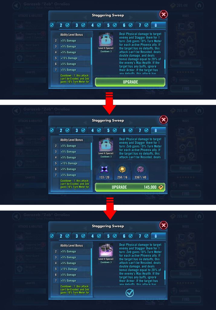
3) in the Attacks and Abilities, and the Gear equipping screens:
widening the text and equipment areas to eliminate scrolling
Star1.
Tier colors and dots added to mod filters screen
.
.
.
Star2.
The background gear wreath was too dominating to be in focus with the hero so it was blurred with the background to allow focus on the important items but still allowing the player to appreciate the earned prestige.
.
.
.
Star3.
Scrolling simply cannot be eliminated as some bodies of text will always be expanding. That said, the amount of scrolling can be reduced by only showing the upgrade requirements when the player clicks "Upgrade", then the text window shrinks to see what is needed. Once the player completes the transaction, the text window expands again and the "completed" check mark is displayed in a smaller fashion.
Post edited by DarthRefundius on
79
Replies
I’m particularly excited about 1, 4, and 5.
I really like all your suggestion. Maybe there are an inspiration for the art team to give the game a new paint.
Great work on the suggestions! 1 is my favourite.
Discord: Iona Starbound#5299
It’s aesthetics and game play feel and player satisfaction that generates revenue. Many of these ideas would actually help the game mature better which in turn makes players feel more invested and comfortable spending.
I'd rather have them spend effort on other things, but if they said they had a guy in a corner that's been working on stuff like this for a while and boom it's done I would have zero complaints. Maybe some grumbling about having to adjust, but whatevs
on the clones- I think some of the toons should have 'outfits', minor changes that's just some customization the player can choose from. Clones with or without helmets. RHan as we have him or as we saw him from Chewbacca event. JTR in current clothes or what she was wearing while with Luke on the island. Vader or battle-damaged vader. Hood up or hood down. Small things like that. Again, I'd rather have them work on other things tho
Good post with great exsamples
CG ought to take some notice as the game is becoming old and stale.
I stopped spending money a long time ago and wonder sonendays why I even bother logging in. An overhaul of look of the game might get more mileage and may encourage me to once again support the developers (who I am at odds with over many other issues but we won't go there)
Well done mate!
And I 'll add, I'd love to see animations in fleet battles exactly like fights in Marvel SF
yeah, it's copy paste and all, but for fleet battles target camera and battle animation per ship would be so much amazing, Just imagining TIE fighter running in the mids of enemie composition and killing ship warms my heart.
This is one of the most important posts I’ve ever read. Love the creativity and proposed changes.
Seriously, youre awesome. I would love to see all of the above.
If you could do this in your free time, CG should also be able to........ These would make the game so much more amazing.
Someone hire this man. Id want all of that.
Especially #5
Yes this is really annoying. It's worse for marvel strike force but still needs improvement for swgoh